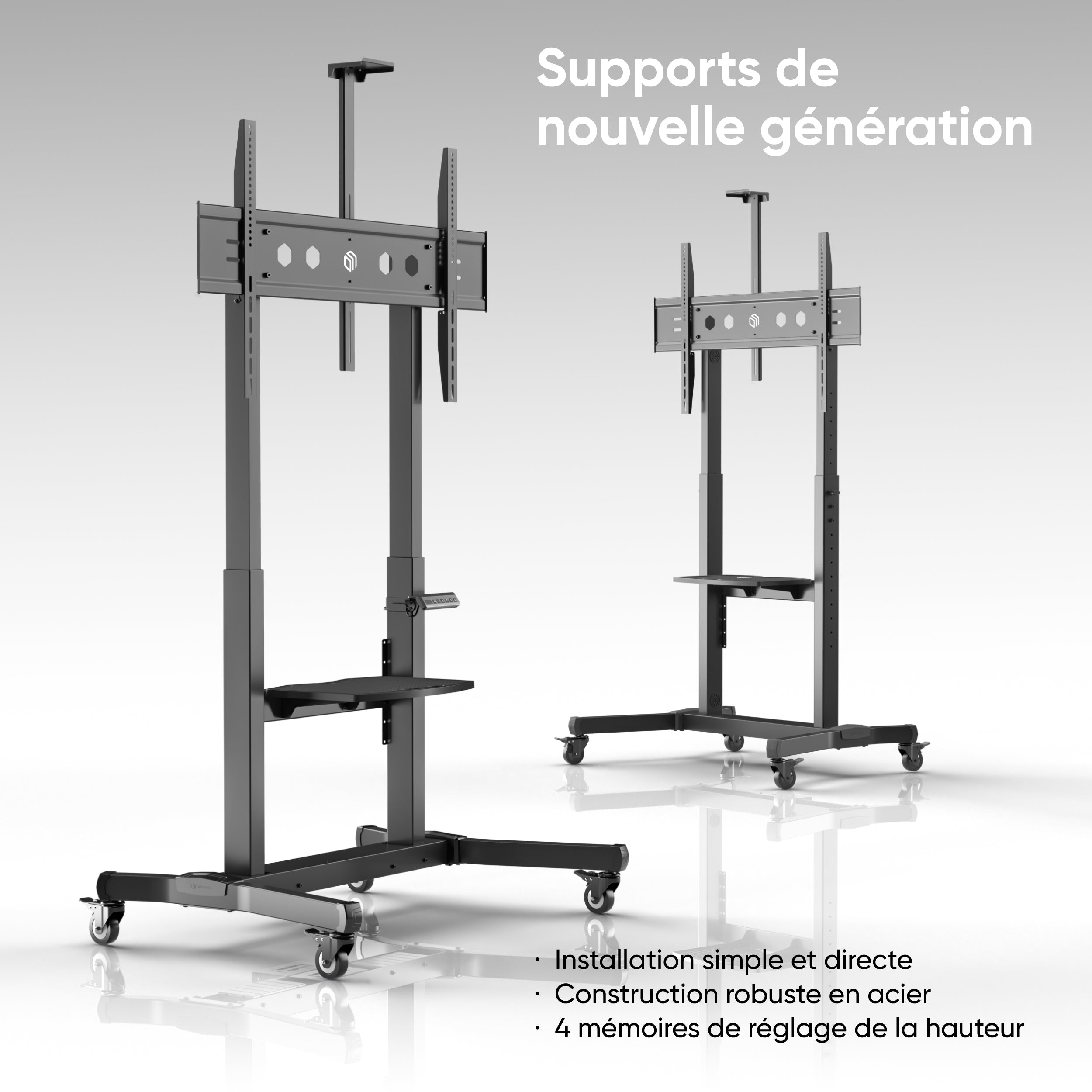
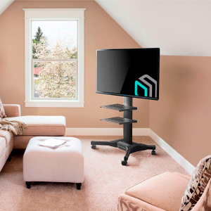
Description
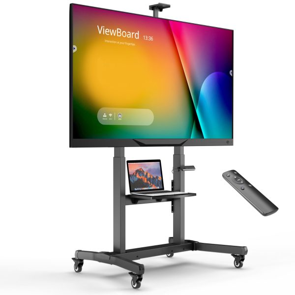
Support mobile motorisé pour téléviseurs ou panneaux interactifs 50″-100″, max 120 kg, noir TS1991E
.main-content-container {
display: -webkit-box;
display: -ms-flexbox;
display: flex;
-ms-flex-wrap: wrap;
flex-wrap: wrap;
-webkit-box-pack: center;
-ms-flex-pack: center;
justify-content: center;
width: 100%;
}
#content-layout {
max-width: 1280px;
width: 100%;
font-size: 16px;
}
iframe {
max-width: 1280px;
width: 100%;
margin-bottom: 30px;
border-radius: 16px;
}
.layout-header {
position: relative;
display: -webkit-box;
display: -ms-flexbox;
display: flex;
-webkit-box-orient: vertical;
-webkit-box-direction: normal;
-ms-flex-direction: column;
flex-direction: column;
-webkit-box-align: center;
-ms-flex-align: center;
align-items: center;
-webkit-box-pack: start;
-ms-flex-pack: start;
justify-content: flex-start;
width: 100%;
}
.layout-header__img {
width: 100%;
}
@media screen and (max-width: 480px) {
.layout-header__img {
border-radius: 16px;
background: -webkit-gradient(linear, left bottom, left top, from(rgb(255, 255, 255)), to(rgb(204, 204, 204)));
background: linear-gradient(0deg, rgb(255, 255, 255) 0%, rgb(204, 204, 204) 100%);
}
}
.layout-header .layout-header__title {
position: absolute;
font-size: clamp(1.063em, 4.479vw + 0.167em, 3.75em);
font-weight: 600;
color: #000 !important;
text-align: center;
margin: 0.5em 0 !important;
}
@media screen and (max-width: 480px) {
.layout-header .layout-header__title {
position: static;
text-align: center;
}
}
.layout-header_mob {
display: none;
}
.layout-icons {
display: -webkit-box;
display: -ms-flexbox;
display: flex;
-webkit-box-pack: justify;
-ms-flex-pack: justify;
justify-content: space-between;
-webkit-box-sizing: border-box !important;
box-sizing: border-box !important;
padding: 0 5% !important;
width: 100%;
list-style-type: none;
gap: 2%;
margin: 0 !important;
margin-bottom: 0 !important;
}
.layout-icons .layout-icons__item {
display: -webkit-box;
display: -ms-flexbox;
display: flex;
-webkit-box-orient: vertical;
-webkit-box-direction: normal;
-ms-flex-direction: column;
flex-direction: column;
-webkit-box-align: center;
-ms-flex-align: center;
align-items: center;
width: 16.6666666667%;
margin: 0 !important;
}
.layout-icons .layout-icons__item:nth-child(3) .item__img-wrapper {
padding: 0 !important;
margin-left: 18% !important;
}
.layout-icons .layout-icons__item .item__img-wrapper {
height: clamp(1.125em, 5.521vw + 0.021em, 4.438em);
-webkit-box-sizing: border-box;
box-sizing: border-box;
padding: 5% 0 !important;
}
.layout-icons .layout-icons__item .item__img-wrapper .item__img {
height: 100%;
}
.layout-icons .layout-icons__item .item__title {
text-align: center;
font-size: clamp(0.375em, 1.875vw + 0em, 1.5em);
color: #000;
margin: 12px 0 !important;
font-weight: 600;
}
.layout-icons .layout-icons__item .item__desc {
font-size: clamp(0.25em, 1.354vw – 0.021em, 1.063em);
}
.full-img {
position: relative;
display: -webkit-box;
display: -ms-flexbox;
display: flex;
width: 100%;
margin: 39.6px 0 !important;
}
.full-img__img {
width: 100%;
}
.full-img_text-left {
-webkit-box-pack: start;
-ms-flex-pack: start;
justify-content: flex-start;
}
.full-img_text-right {
-webkit-box-pack: end;
-ms-flex-pack: end;
justify-content: flex-end;
}
.full-img_text-center {
-webkit-box-pack: center;
-ms-flex-pack: center;
justify-content: center;
}
@media screen and (max-width: 480px) {
.full-img_text-mob-right {
-webkit-box-pack: end;
-ms-flex-pack: end;
justify-content: flex-end;
}
.full-img_text-mob-left {
-webkit-box-pack: start;
-ms-flex-pack: start;
justify-content: flex-start;
}
.full-img_text-mob-bottom {
-webkit-box-pack: center;
-ms-flex-pack: center;
justify-content: center;
}
}
.title-box,
.text-box {
position: absolute;
display: -webkit-box;
display: -ms-flexbox;
display: flex;
width: 50%;
height: 100%;
}
.title-box {
-webkit-box-align: center;
-ms-flex-align: center;
align-items: center;
-webkit-box-sizing: border-box;
box-sizing: border-box;
padding-left: clamp(1.5625em, -1.2188em + 9.2708vw, 7.125em) !important;
}
.title-box__title {
font-size: clamp(0.875em, 5.208vw – 0.167em, 4em);
font-weight: 600 !important;
color: #fff;
line-height: 1 !important;
margin: 1.3em 0 !important;
}
.title-box__title_mob {
display: none;
}
@media screen and (max-width: 480px) {
.title-box__title_desc {
display: none;
}
.title-box__title_mob {
display: block;
}
}
.title-box_block1,
.title-box_block2 {
-webkit-box-align: center;
-ms-flex-align: center;
align-items: center;
width: 50%;
-webkit-box-sizing: border-box;
box-sizing: border-box;
padding: 0 5% !important;
padding-left: 15% !important;
}
@media screen and (max-width: 480px) {
.title-box_block1,
.title-box_block2 {
-webkit-box-align: start;
-ms-flex-align: start;
align-items: flex-start;
padding-left: 5% !important;
}
}
.title-box_block2 {
padding-left: 10% !important;
}
.title-box_block3 {
width: 45%;
padding-right: 5%;
}
.title-box_block3 .title-box__title {
color: #000;
}
@media screen and (max-width: 480px) {
.title-box_block3 {
-webkit-box-align: end;
-ms-flex-align: end;
align-items: flex-end;
width: 60%;
}
}
.title-box_block4 .title-box__title,
.title-box_block5 .title-box__title {
color: #000;
}
.title-box_block4 {
width: 45%;
-webkit-box-align: start;
-ms-flex-align: start;
align-items: flex-start;
}
.title-box_block5 {
width: 40%;
}
@media screen and (max-width: 480px) {
.title-box_block5 {
-webkit-box-align: end;
-ms-flex-align: end;
align-items: flex-end;
}
.title-box_block5 .title-box__title {
color: #fff;
}
}
.grid-layout {
display: -webkit-box;
display: -ms-flexbox;
display: flex;
-ms-flex-wrap: wrap;
flex-wrap: wrap;
-webkit-box-pack: justify;
-ms-flex-pack: justify;
justify-content: space-between;
width: 100%;
gap: 12px;
margin: 39.6px 0 !important;
}
.grid-layout__grid-item {
position: relative;
display: -webkit-box;
display: -ms-flexbox;
display: flex;
-webkit-box-orient: vertical;
-webkit-box-direction: normal;
-ms-flex-direction: column;
flex-direction: column;
-webkit-box-pack: start;
-ms-flex-pack: start;
justify-content: flex-start;
-webkit-box-align: end;
-ms-flex-align: end;
align-items: flex-end;
color: #fff;
-webkit-box-flex: 2;
-ms-flex: 2 40%;
flex: 2 40%;
}
@media screen and (max-width: 480px) {
.grid-layout__grid-item {
-webkit-box-flex: 1;
-ms-flex: 1 100%;
flex: 1 100%;
}
}
.grid-layout__grid-item .grid-item__img {
width: 100%;
border-radius: 16px;
}
.grid-layout__grid-item .grid-item__title {
position: absolute;
color: #000;
font-size: clamp(1.063em, 2.875vw + 0.2em, 2.5em);
margin-top: 23%;
margin-right: 10%;
font-weight: 600;
}
@media screen and (max-width: 480px) {
.grid-layout__grid-item .grid-item__title {
font-size: clamp(1.063em, 5vw + 0.063em, 1.563em);
margin-right: 17%;
margin-top: 15%;
}
}
.grid-six-layout {
display: -ms-grid;
display: grid;
-ms-grid-columns: (1fr)[3];
grid-template-columns: repeat(3, 1fr);
-ms-grid-rows: (1fr)[2];
grid-template-rows: repeat(2, 1fr);
gap: clamp(0.625em, 3.393vw – 0.054em, 3em);
padding: 0 5%;
margin: 5% 0;
}
.grid-six-layout .grid-six-layout__grid-item {
display: -webkit-box;
display: -ms-flexbox;
display: flex;
-webkit-box-orient: vertical;
-webkit-box-direction: normal;
-ms-flex-direction: column;
flex-direction: column;
-ms-flex-pack: distribute;
justify-content: space-around;
}
.grid-six-layout .grid-six-layout__grid-item:nth-child(2), .grid-six-layout .grid-six-layout__grid-item:nth-child(5) {
-webkit-box-orient: vertical;
-webkit-box-direction: reverse;
-ms-flex-direction: column-reverse;
flex-direction: column-reverse;
}
.grid-six-layout .grid-six-layout__grid-item .full-img__img {
width: 100%;
margin: 5px 0;
}
.grid-six-layout .grid-six-layout__grid-item .grid-item__title {
font-size: clamp(1.063em, 1.042vw + 0.854em, 1.688em);
color: #000;
margin: auto 0;
padding-left: 4%;
line-height: 1;
font-weight: 600;
}
@media screen and (max-width: 480px) {
.grid-six-layout .grid-six-layout__grid-item .grid-item__title {
padding: 0;
}
}
@media screen and (max-width: 768px) {
.grid-six-layout {
-ms-grid-columns: 1fr;
grid-template-columns: 1fr;
row-gap: 20px;
}
.grid-six-layout .grid-six-layout__grid-item {
-webkit-box-align: center;
-ms-flex-align: center;
align-items: center;
-webkit-box-pack: center;
-ms-flex-pack: center;
justify-content: center;
text-align: center;
-webkit-box-orient: vertical;
-webkit-box-direction: reverse;
-ms-flex-direction: column-reverse;
flex-direction: column-reverse;
}
.grid-six-layout .grid-six-layout__grid-item .grid-item__title {
text-align: center;
margin-top: 10px;
}
}
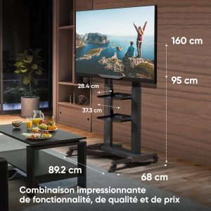
-
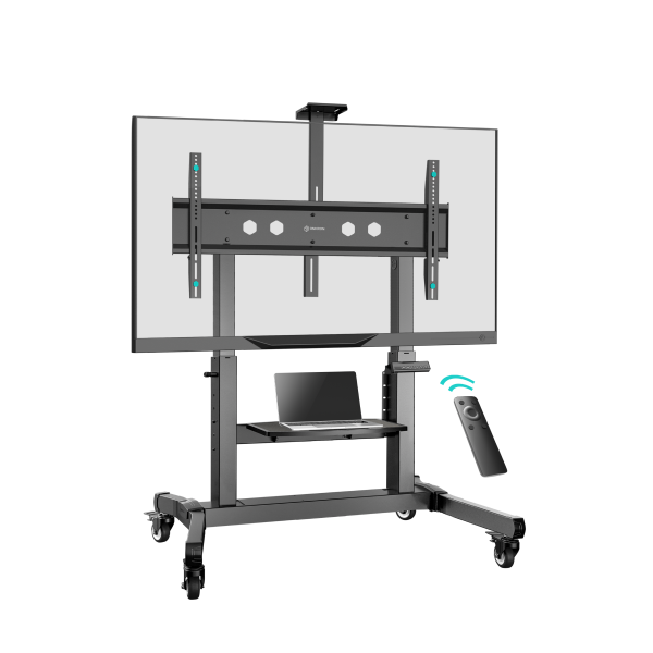
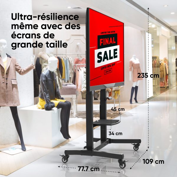
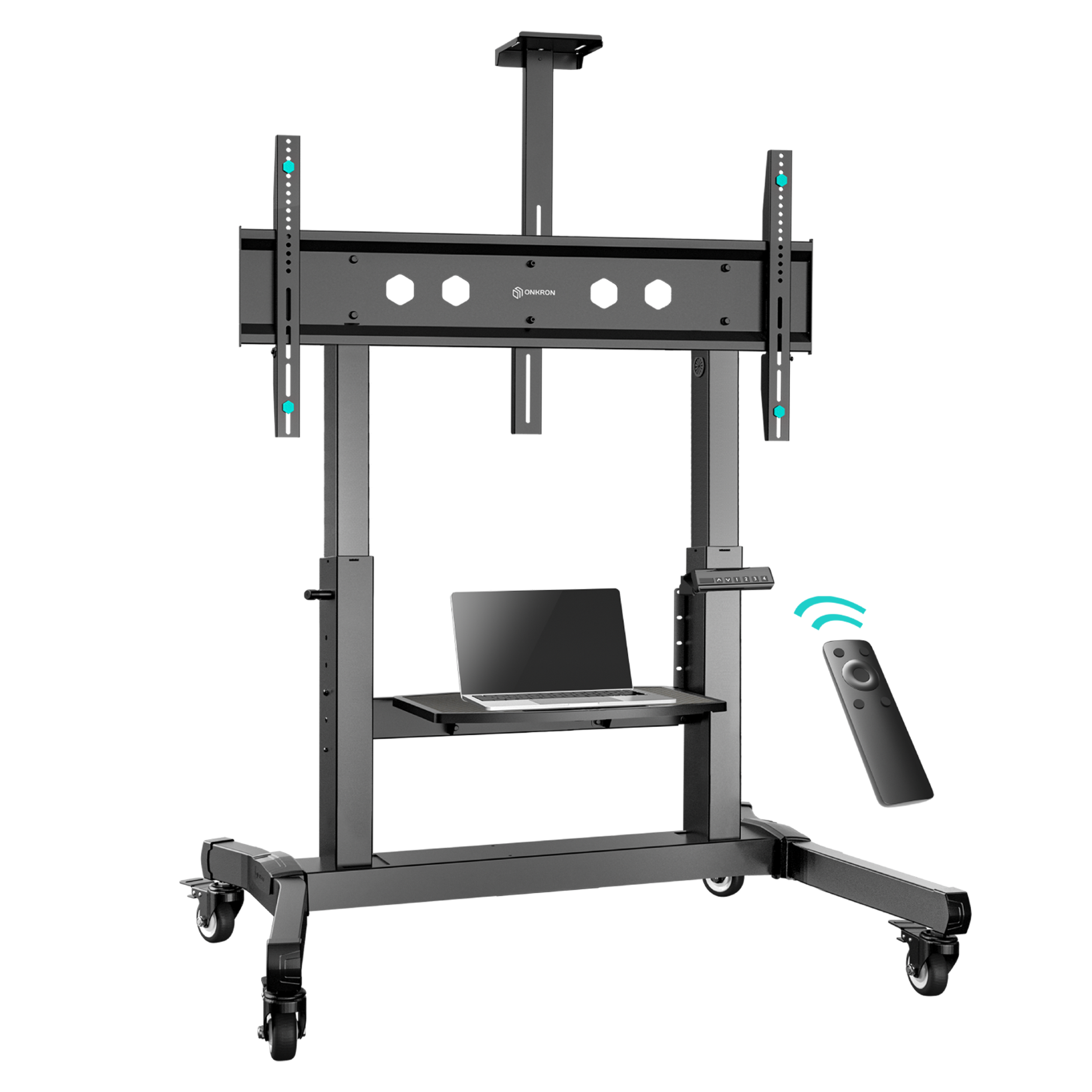
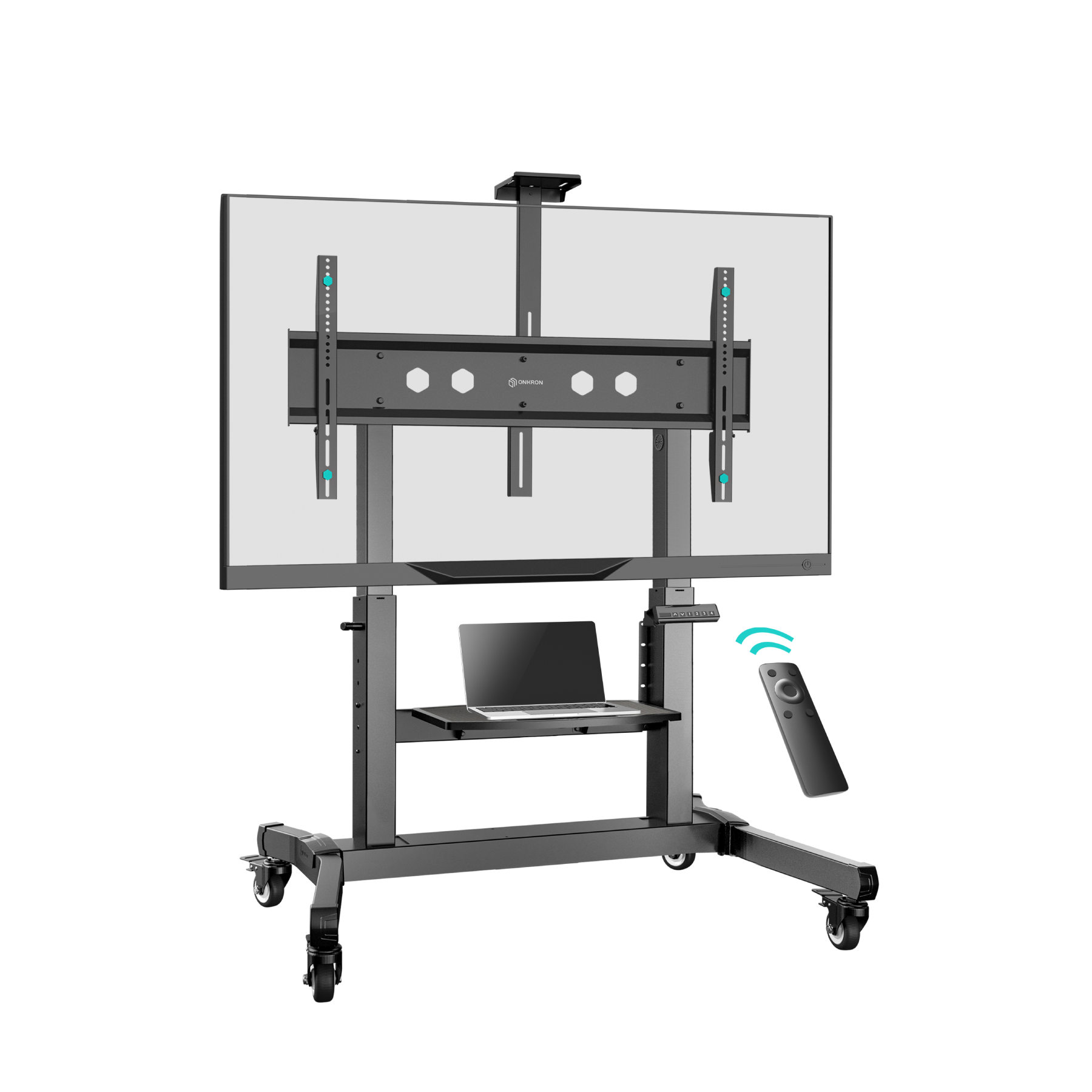
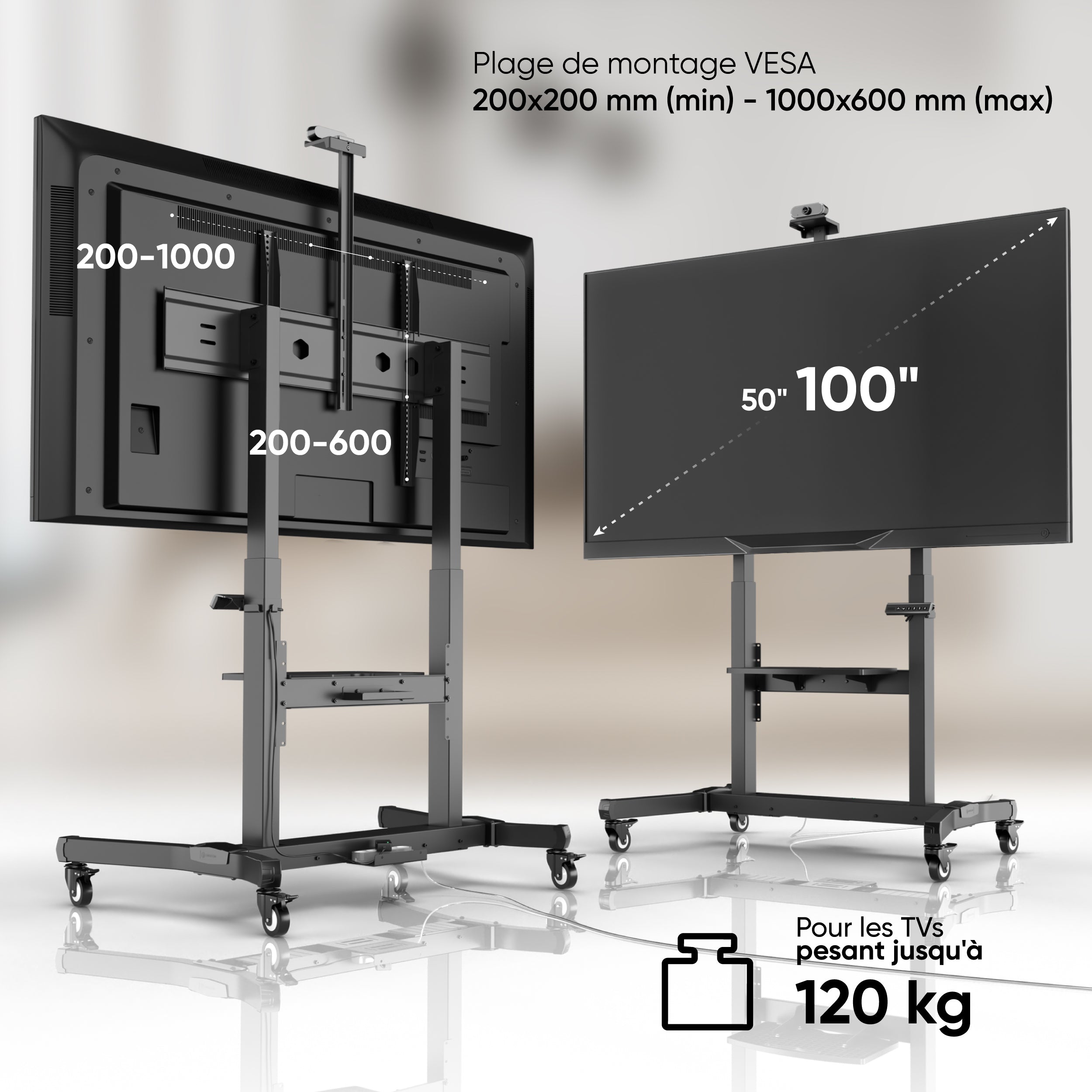
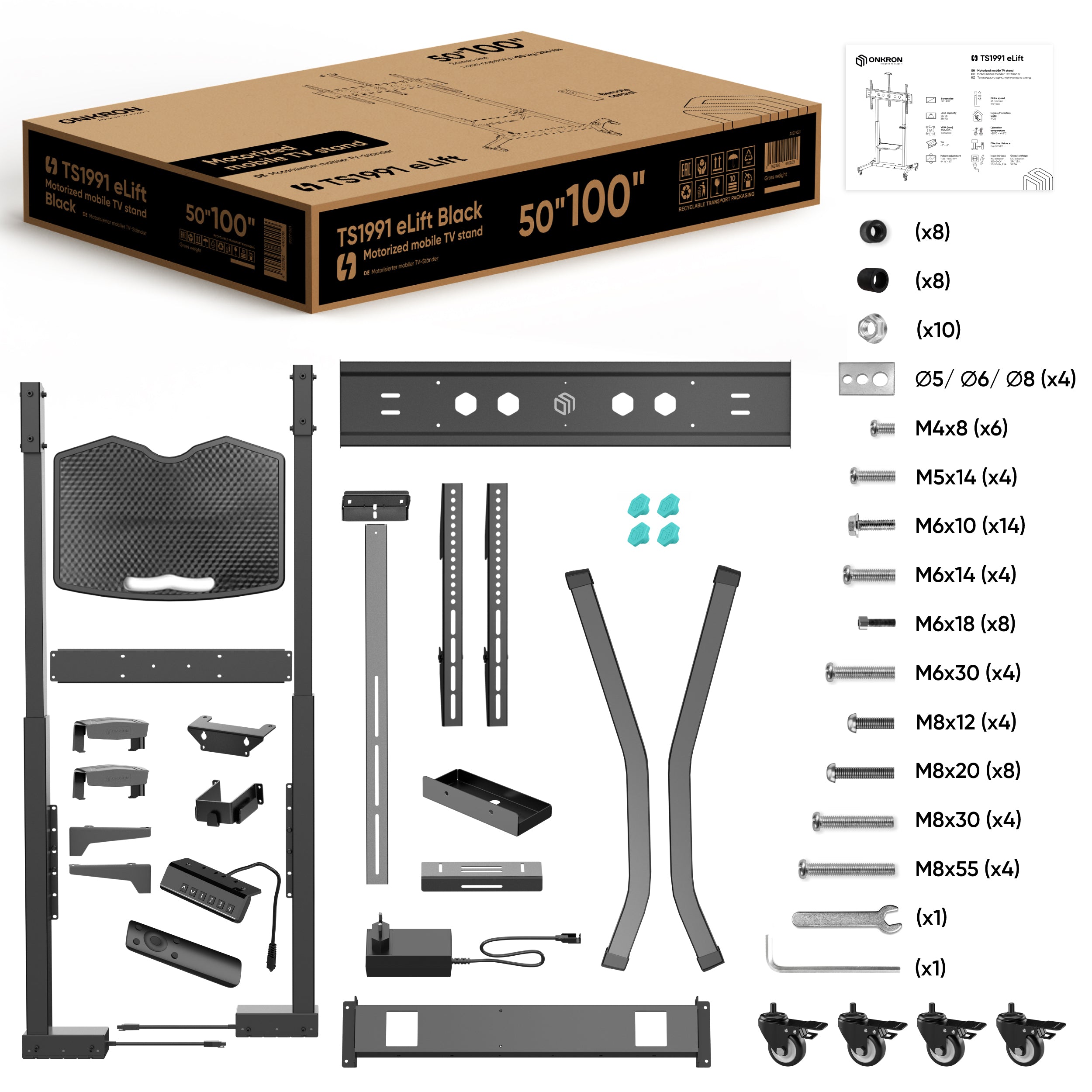
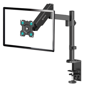
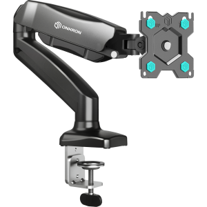
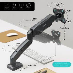
VESA
200×200 – 1000×600
-
Charge totale
130 kg
-
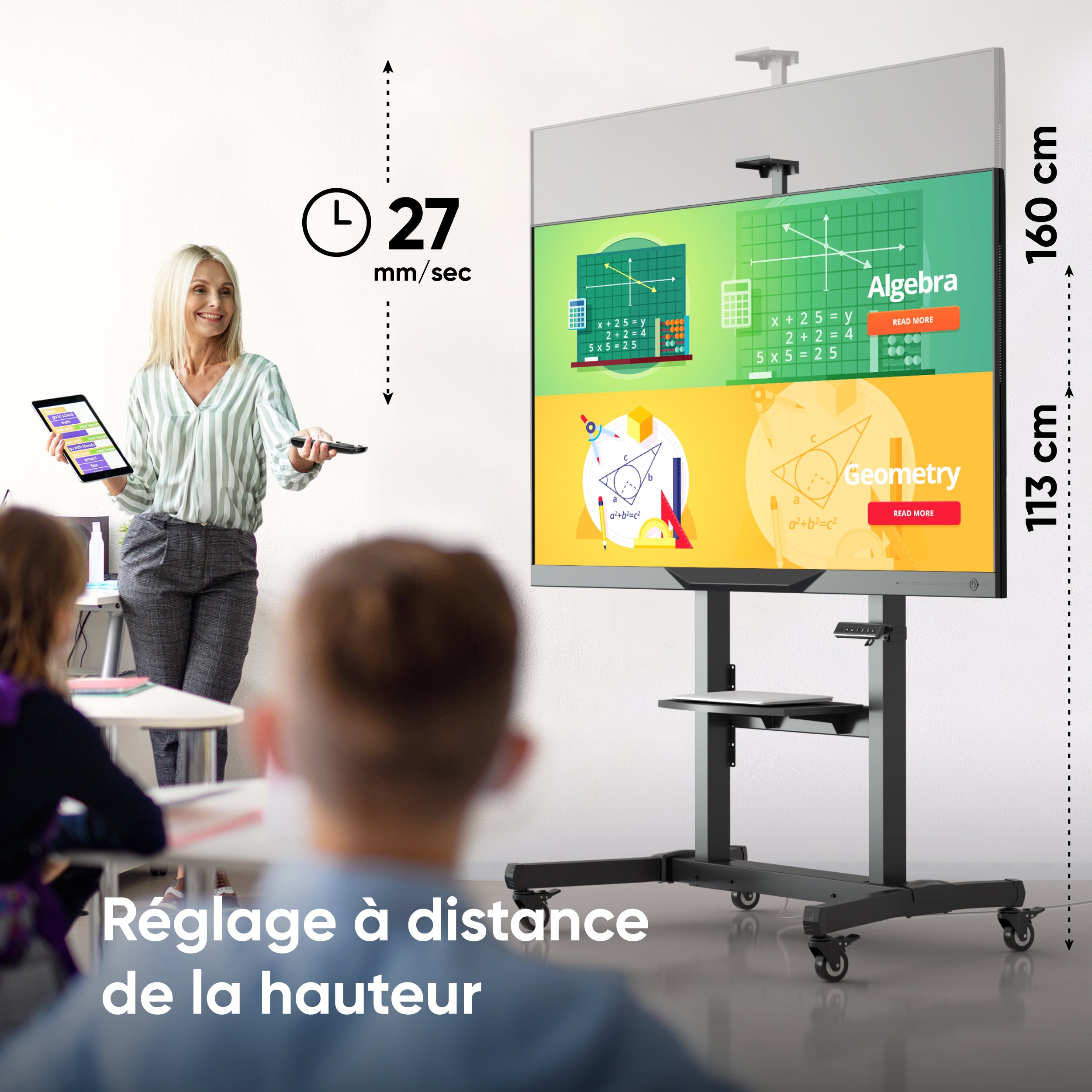
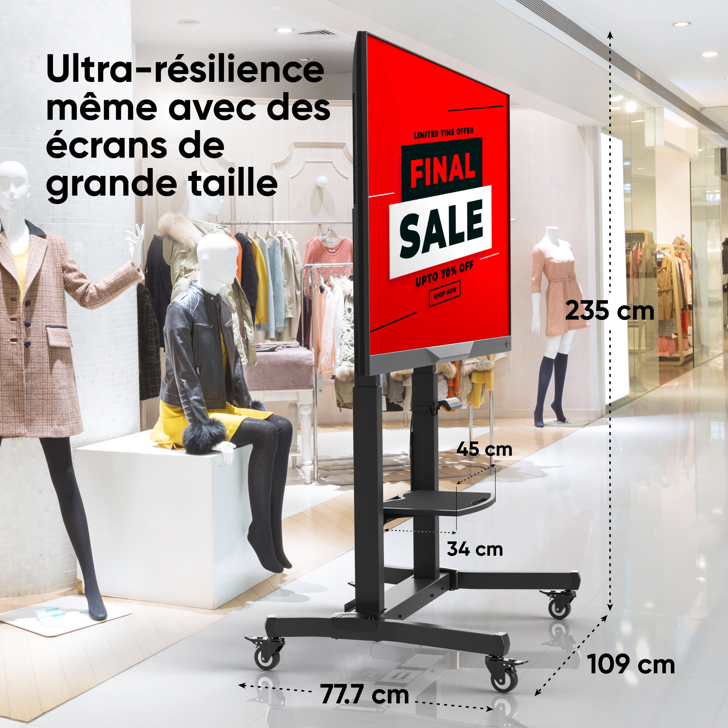
Réglage de la hauteur
113 – 160 cm
-
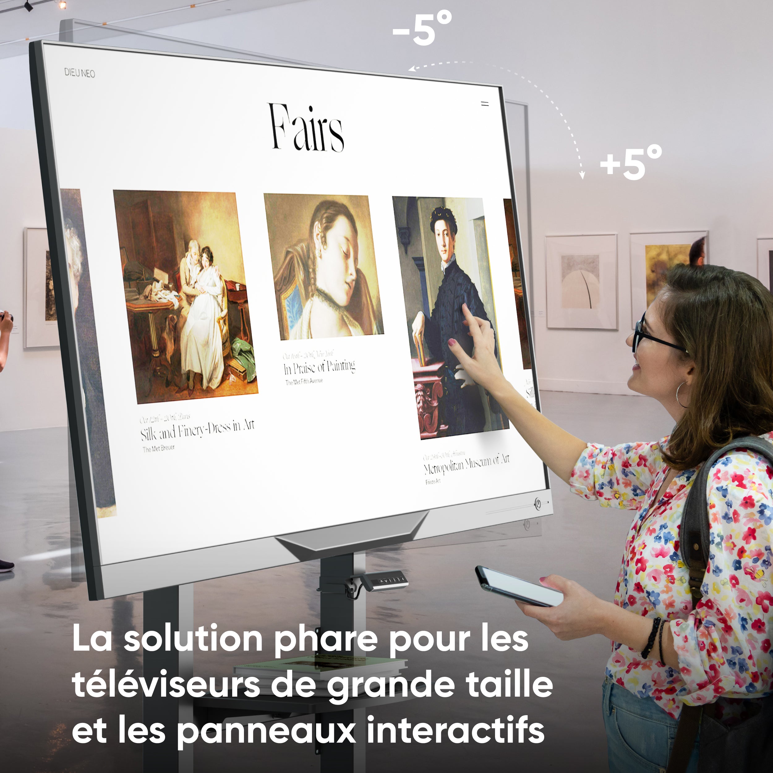
Inclinaison
+5° ~ -5°
-
Diagonale
50″– 100″
-
Poids max. du
120 kg
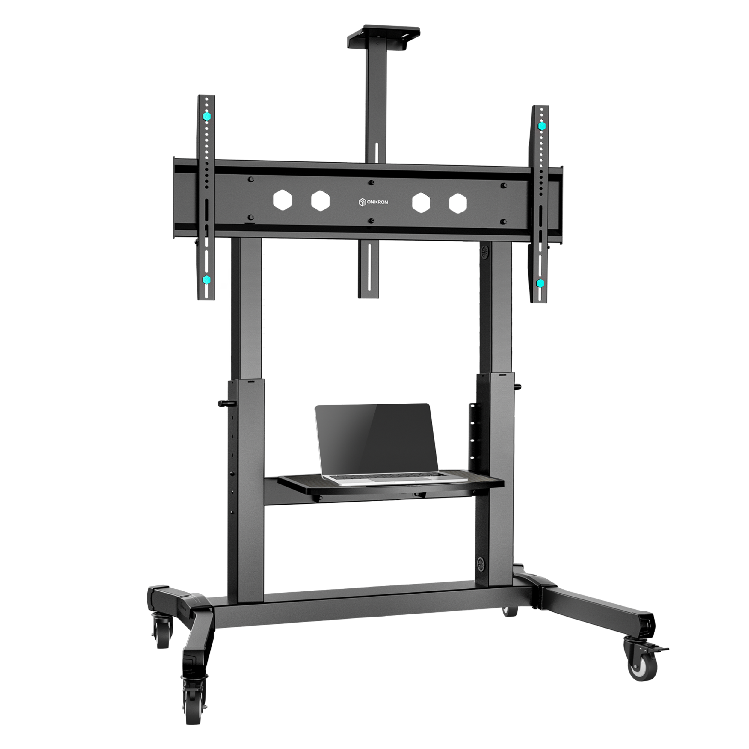
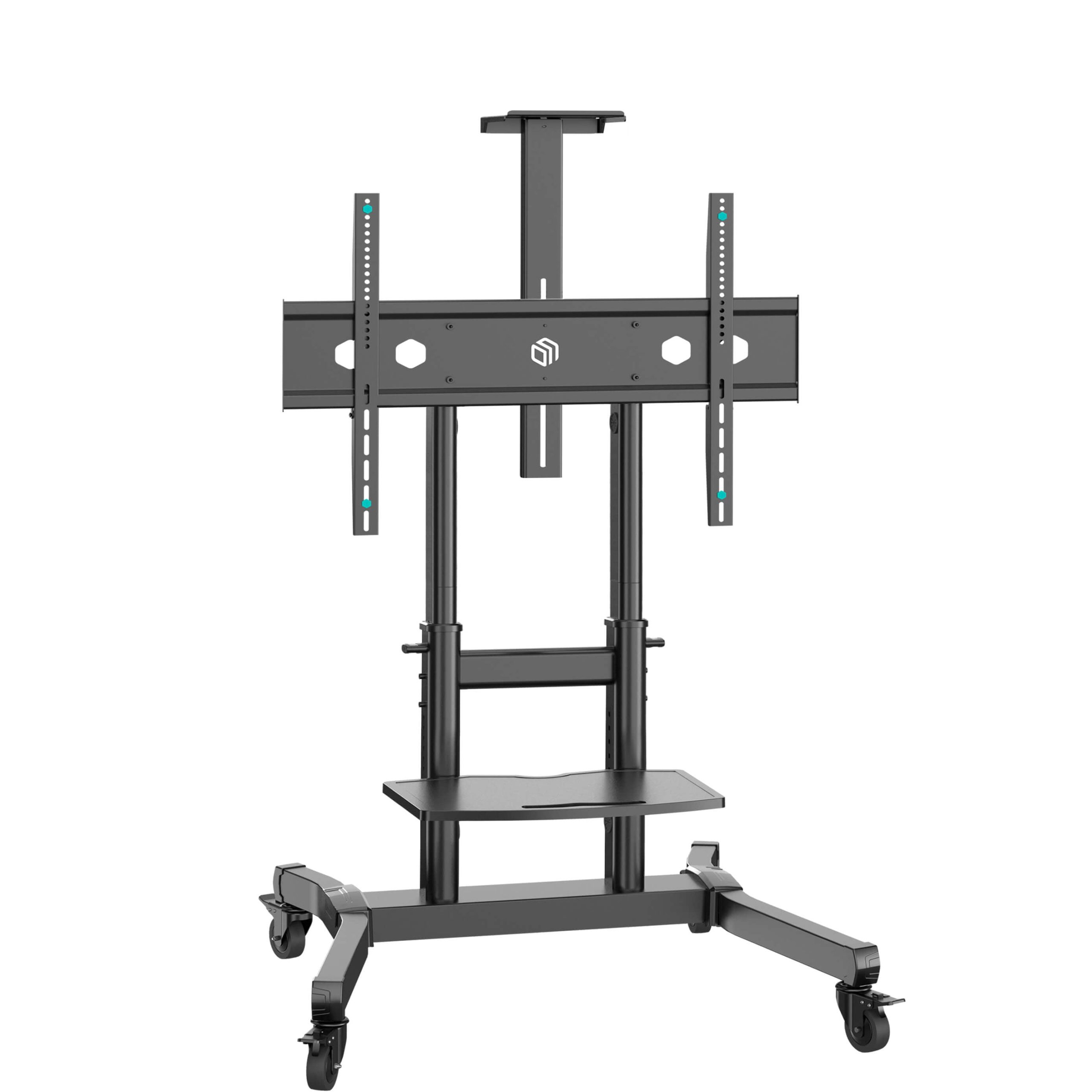
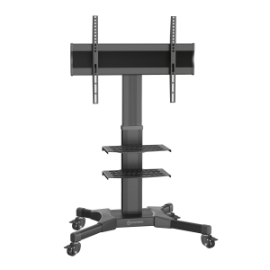
Réglage
de l’angle
de l’écran
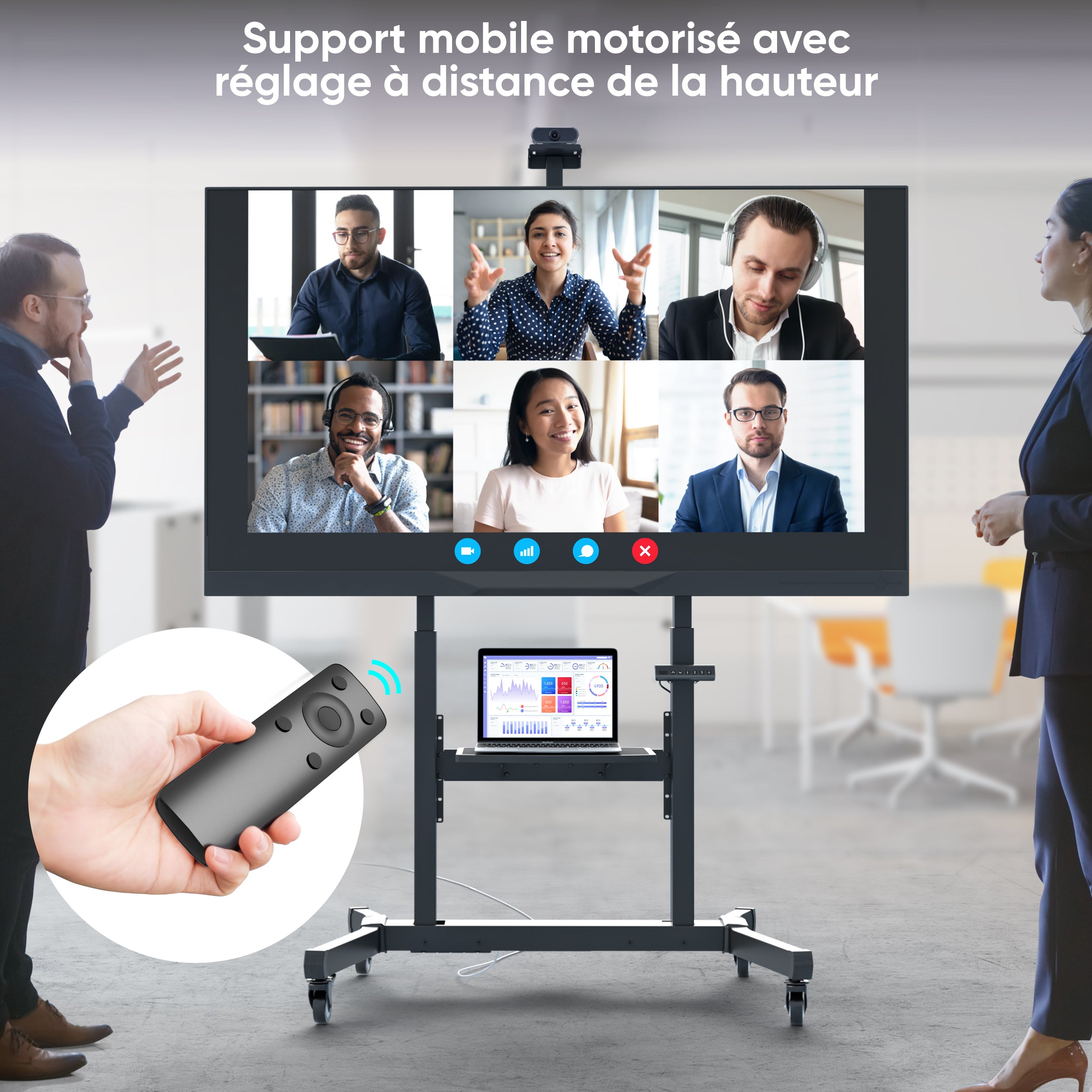
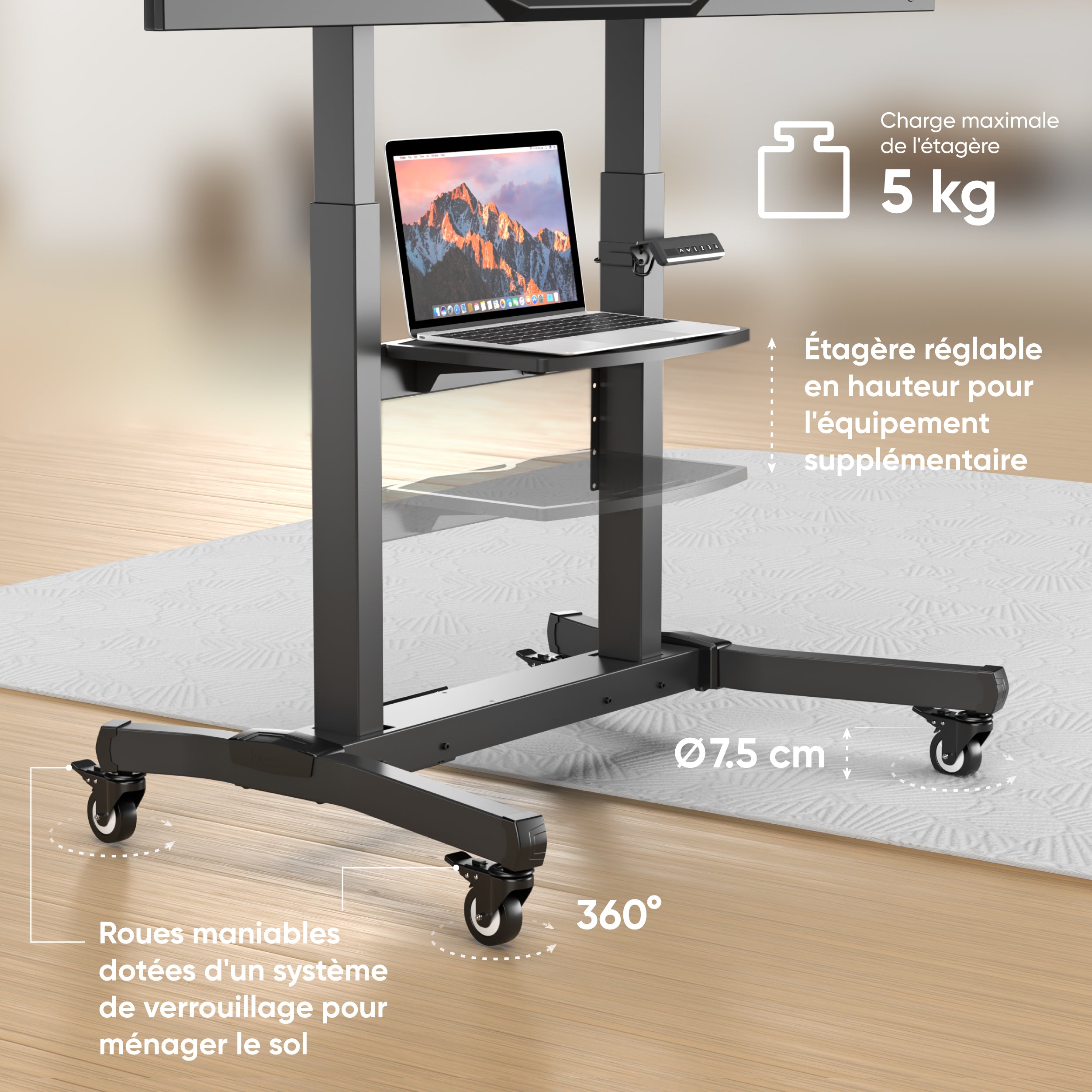
Réglage de la hauteur par simple pression d’une touche
Moteurs synchronisés silencieux
Étagère pour les équipements supplémentaires
Étagère pratique pour caméra
Roues robustes avec système de verrouillage
VESA
200×200 – 1000×600 мм
Indispensable pour les conférences d’affaires
Convient
à pour les
conférences
d’affaires
Solution innovante pour les présentations professionnelles
Idéal pour les
présentations
Partie intégrante du processus d’apprentissage
Confortable pour
les études
Solution technologique pour les expositions ou les musées
Solution excellente
pour les expositions
Confort maximal à domicile
Pratique pour
la maison